RetailMeNot / Extension
Rethinking the RetailMeNot Browser Extension
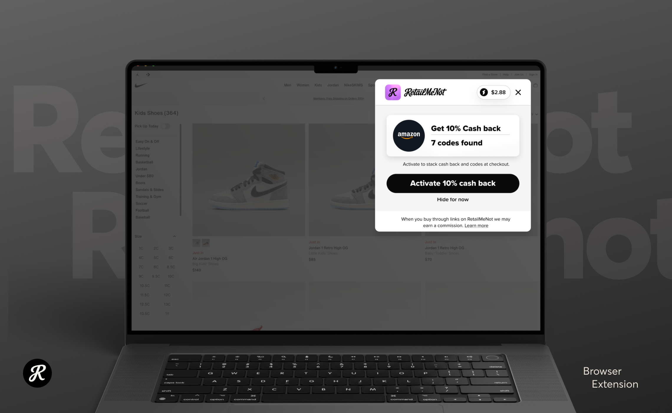
A retention and acquisition project that turned into a full redesign. Now in production. 80% of tested users preferred the new dockable FAB.
- Role
- Product Design Lead. User research, competitive analysis, visual and interaction design, and testing, from discovery through launch.
- 80%
- Preferred new position
- Bottom-left
- FAB placement
- Live
- In production
The extension was losing ground on retention and acquisition at the same time. I led a research-driven push to answer one question: how do we rethink the design and footprint to keep the users we have and win new ones? What began as an optimization effort turned into a full overhaul.
The redesign replaced a screen-hogging launch experience with a dockable FAB that hands control back to the user, and it claimed browser real estate no competitor was fighting for.
Problem
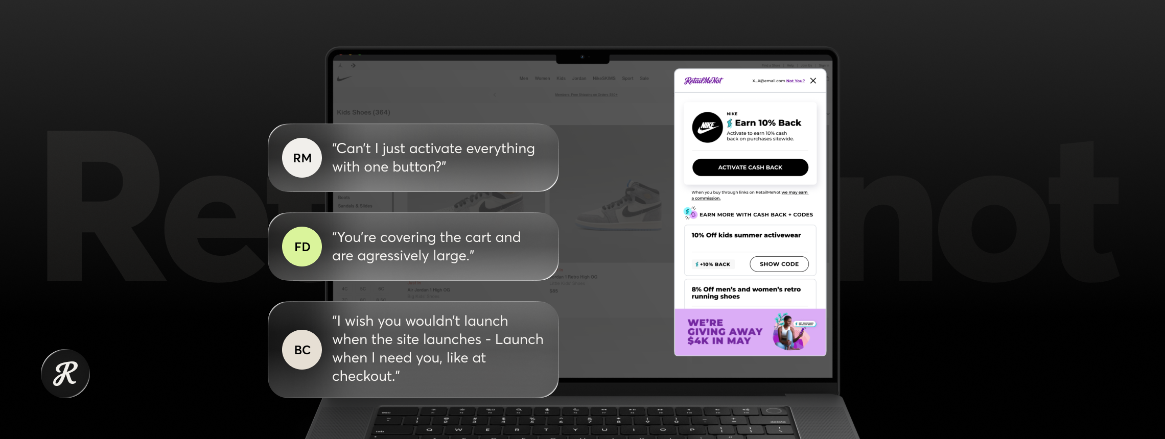
Our extension took up too much space and gave users too little control. How might we shrink the footprint without shrinking the value?
Background
The extension had to work harder on two fronts at once, keeping the users we had and earning new ones. Before proposing anything I needed to know how people were actually using it.
So I ran baseline testing with current users. A short set of questions built for a fast read on where the experience worked and where it created friction. The mandate was broad, so the research cast a wide net instead of probing one hypothesis.
The results came back broad too, and not in our favor. Users had problems with our branding, our size, our feature set, our controls, and our flow. Nearly every dimension of the product.
That range of feedback settled it. This was not a tuning problem, it was an overhaul. After regrouping with the team and executive leadership, I set three objectives to design against: reduce the visual footprint, increase user control, improve brand presence.
Approach
Competitive analysis
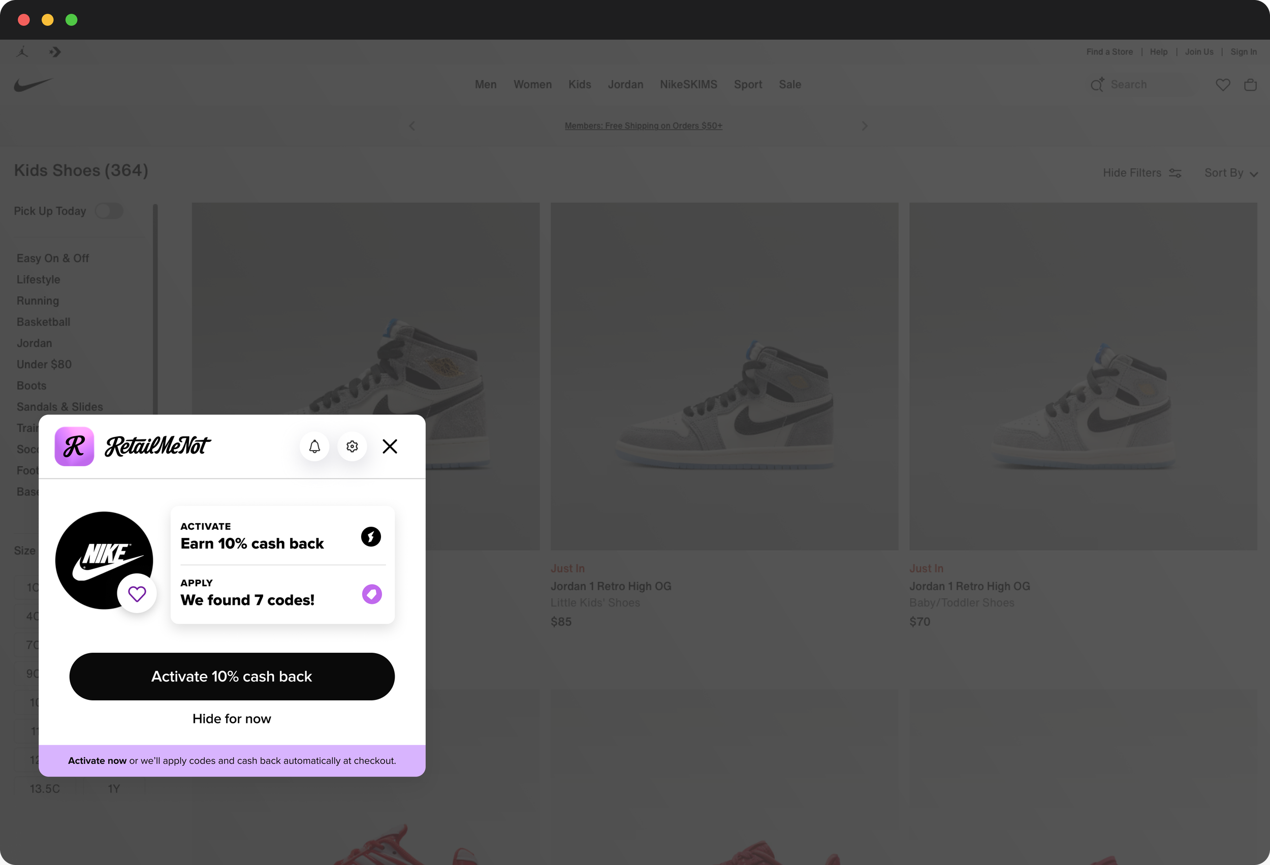
I ran a thorough competitive analysis and found a pattern we were missing entirely. Most direct competitors used a FAB docked inside the browser, working as a persistent, low-cost reminder that deals are waiting. The FAB also puts the user in charge. They open the extension when they want deals and minimize it when they don't. That mapped straight onto our user control objective.
Designing the FAB
I explored a wide range of directions across position, size, shape, color, and branding, running user testing alongside the design work to keep each round honest. We landed on a simple rounded square in our more vibrant purple with a subtle glass effect. Users preferred it in testing, and it did something strategically useful: it set us apart visually from Rakuten, our closest competitor.
Questioning the upper-right corner
Positioning got its own round of testing, and this is where the project's central assumption fell apart. Every extension in the category fights for the upper right corner of the browser, the corner that sits directly on top of the user's cart. With the whole browser window available, we were all crowding into the one spot most likely to block the moment of purchase. Why be a barrier when you could be part of the experience? I tested the FAB in several positions, informed by eye-tracking patterns. Eighty percent of users chose the bottom left.
Solution
The redesign has two halves: the FAB that lives in the browser, and the launch screen it opens.
The FAB
A rounded square in vibrant RetailMeNot purple with a subtle glass treatment, docked bottom left. It stays present without obstructing, separates us from Rakuten, and makes opening and minimizing the extension the user's decision rather than an interruption.
The launch screen
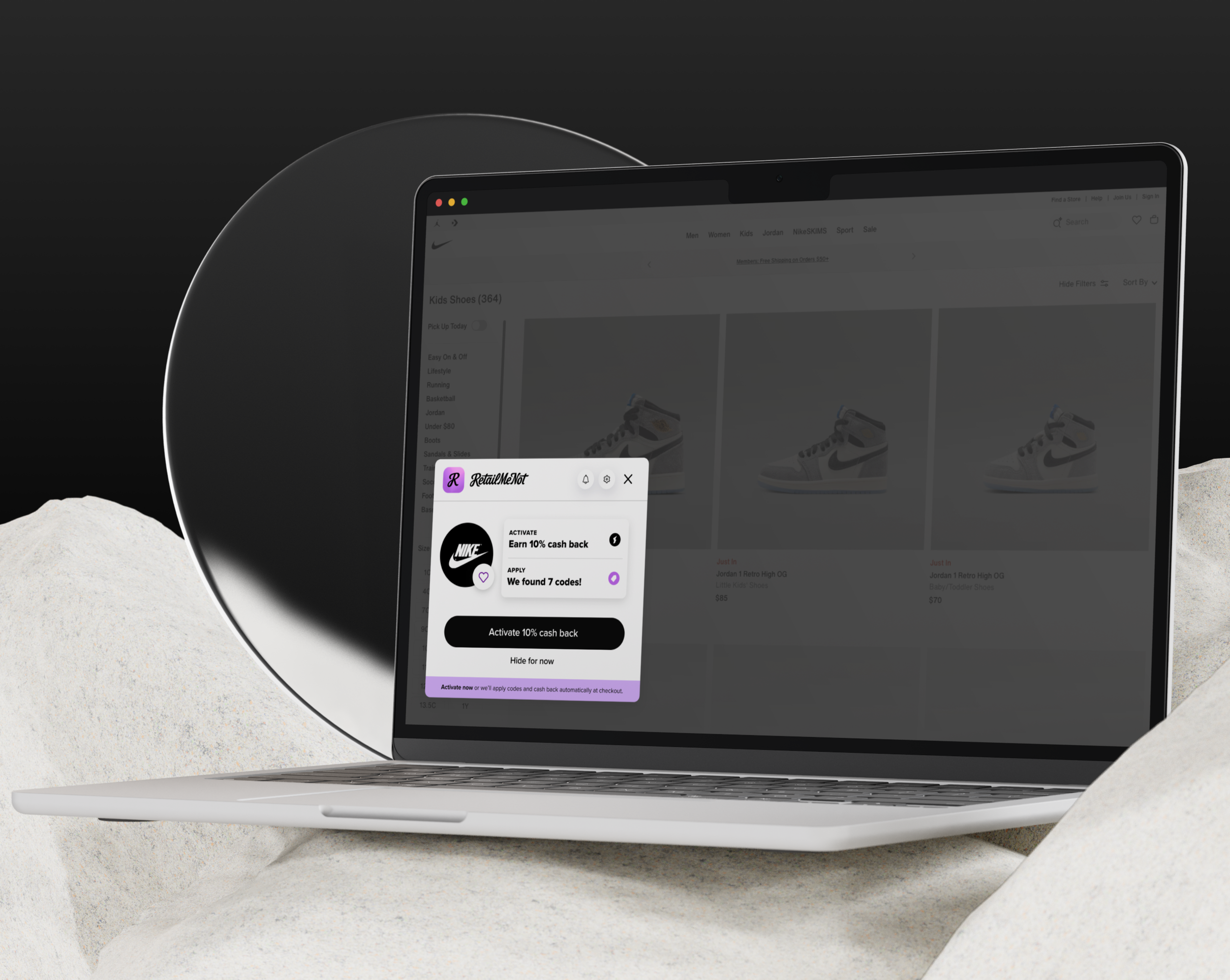
With position, design, and functionality settled, I went after the size complaint at its source. The old launch screen was packed with far too much information, so I reframed it as a question: what is the most important thing the user needs now, at this point in their journey? That exercise produced several viable directions, each a stripped-down screen built around the single most valuable thing at that moment in the shopping flow. Rather than pick one internally, we put them into live testing against each other.
Outcomes
80% of tested users preferred the bottom-left FAB position.
That validated a departure from a category-wide convention and cleared us out of the contested upper-right corner.
Purple glass FAB direction confirmed
Users cited clearer differentiation from Rakuten.
A significantly smaller launch screen
Replacing an interface users consistently called too large and too dense.
Live in production
An A/B/C test is running across the launch screen variants. The winner becomes the new face of the extension.
Reflection
This project taught me how rarely a shared convention gets re-examined.
Every competitor sat in the upper right corner, which made it read as settled. But nobody in the category seemed to have asked whether the corner covering the user's cart was a good place to stand. Competitive analysis usually gets framed as finding out what everyone does so you can match it. Here it was more useful for finding out what everyone assumes so you can test it.
I also came away with more respect for broad, unfocused early research.
The baseline test was not elegant. A short set of questions, a wide net, no strong hypothesis. But the sheer breadth of complaints that came back is what made the case for a full overhaul instead of another round of incremental fixes. Narrower research would have produced a narrower mandate.
The reduction work on the launch screen was the hardest part and the least visible.
Cutting information is a series of small arguments about what matters, and internal opinion could only get us so far. That is why the final call belongs to the A/B/C test rather than to me.