RetailMeNot Extension
Led a retention and acquisition focused initiative that sparked a full design overhaul of the RetailMeNot browser extension.
PROBLEM
How might we re-think our current design/footprint to not only retain users but acquire more?
MY ROLE // Lead Product Designer
Product design, user research, product strategy, stakeholder alignment, information architecture, user flows, visual design, interaction design, copywriting, quality assurance, design guidelines.
KICKOFF + DISCOVERY
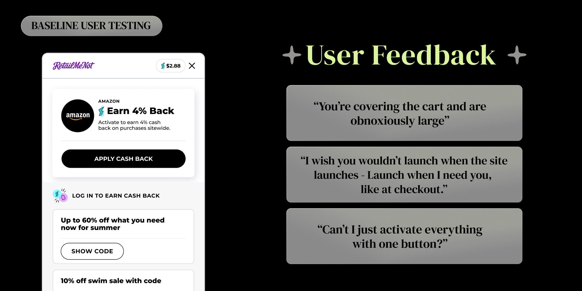
Since we needed to cast a wide net, I began by launching some baseline user testing to see how our users were currently interacting with our browser extension. I asked a small set of questions to current RetailMeNot browser extension users to get a quick read on success and friction points.
EARLY INSIGHTS
Testing results were broad and showed that users had issues with our branding, size, overall feature set, controls and flow.

DEFINE
Early insights made it apparent that a vast overhaul needed to be made to our browser extension. After regrouping with the team and executive leadership, I set out to explore solutions for reducing our visual footprint, increase user control, and improve our brand presence.

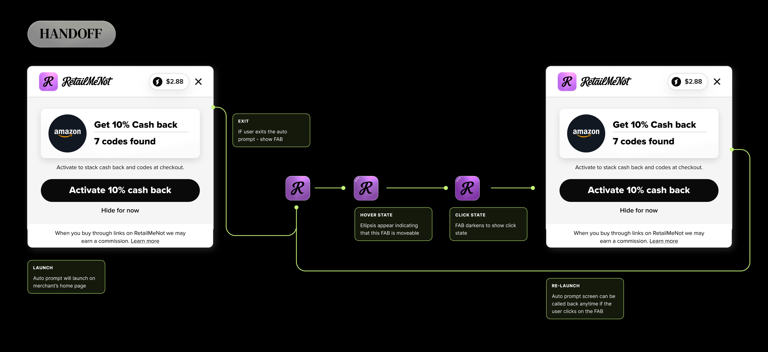
Let’s make a FAB
A lightweight and recognizable shopping companion that puts the control in our users hands, reduces our visual footprint and improves our brand presence.
DESIGN + DEVELOPMENT
During my extensive competitive analysis, I discovered that most of our direct competitors have “FABs” that dock within the browser and remain a constant reminder to the user that “deals await.” The FAB allows users to control their own shopping experience, launching the extension when they want to see the deals and minimizing when they don’t.
I began designing various forms of a FAB focusing on browser positioning, size, shape, color and branding. Along with these designs came more user testing to make sure we were headed in the right direction. Ultimately, we landed on a simple rounded square utilizing our more vibrant purple with a subtle glass effect. Testing showed that users preferred this design as it helped us stand out from our main competitor, “Rakuten”.
I tested on positioning as well, since the current browser extension battle sits in the upper right corner of the screen. Which has always been odd to me, with all of the browser real estate open, why is everyone battling for that top right corner that covers your cart? Why be a barrier when you can be seamlessly part of the experience? I tested the new FAB in a few different positions within the browser based on eye tracking movements and to my utter joy, 80% of users chose the bottom left. No more battling the upper right!

OUTCOMES
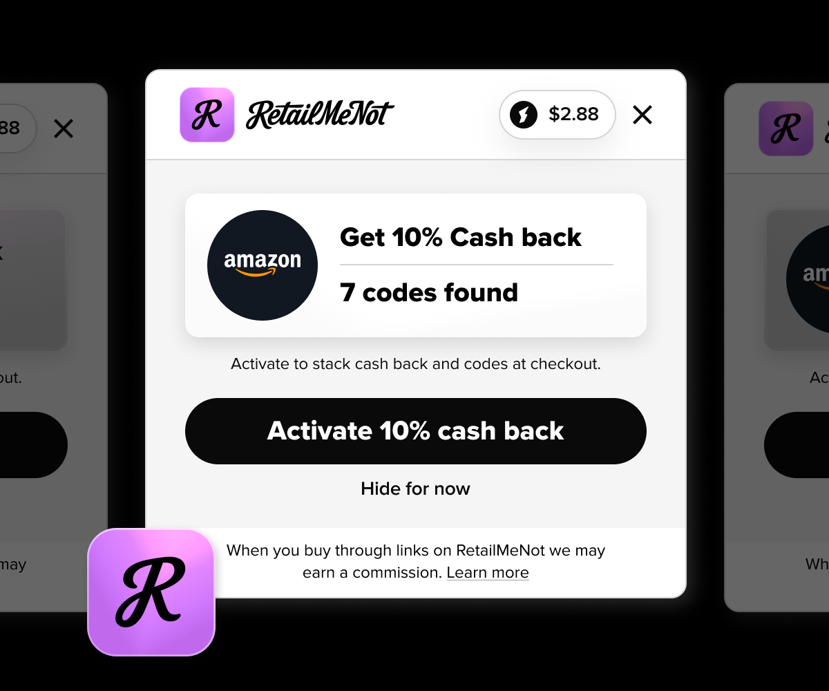
With the position, design and functionality set for the new FAB, I also worked on reducing the overall launch screen that the user sees in order to address the issue of our overall “size”. This issue with our previous launch screen was that it was packed with far too much information. The question became, “What is the most important information the users needs at this moment in their journey?” This exercise in reduction led me to a few designs that we decided to live test against each other.
This work is currently in production and testing. The winner of the A/B/C test will be the new face of the RetailMeNot Browser extension.

Full project file “Birds Eye view”
Handed Off - RetailMeNot FAB & RetailMeNot launch screens (A/B/C test)