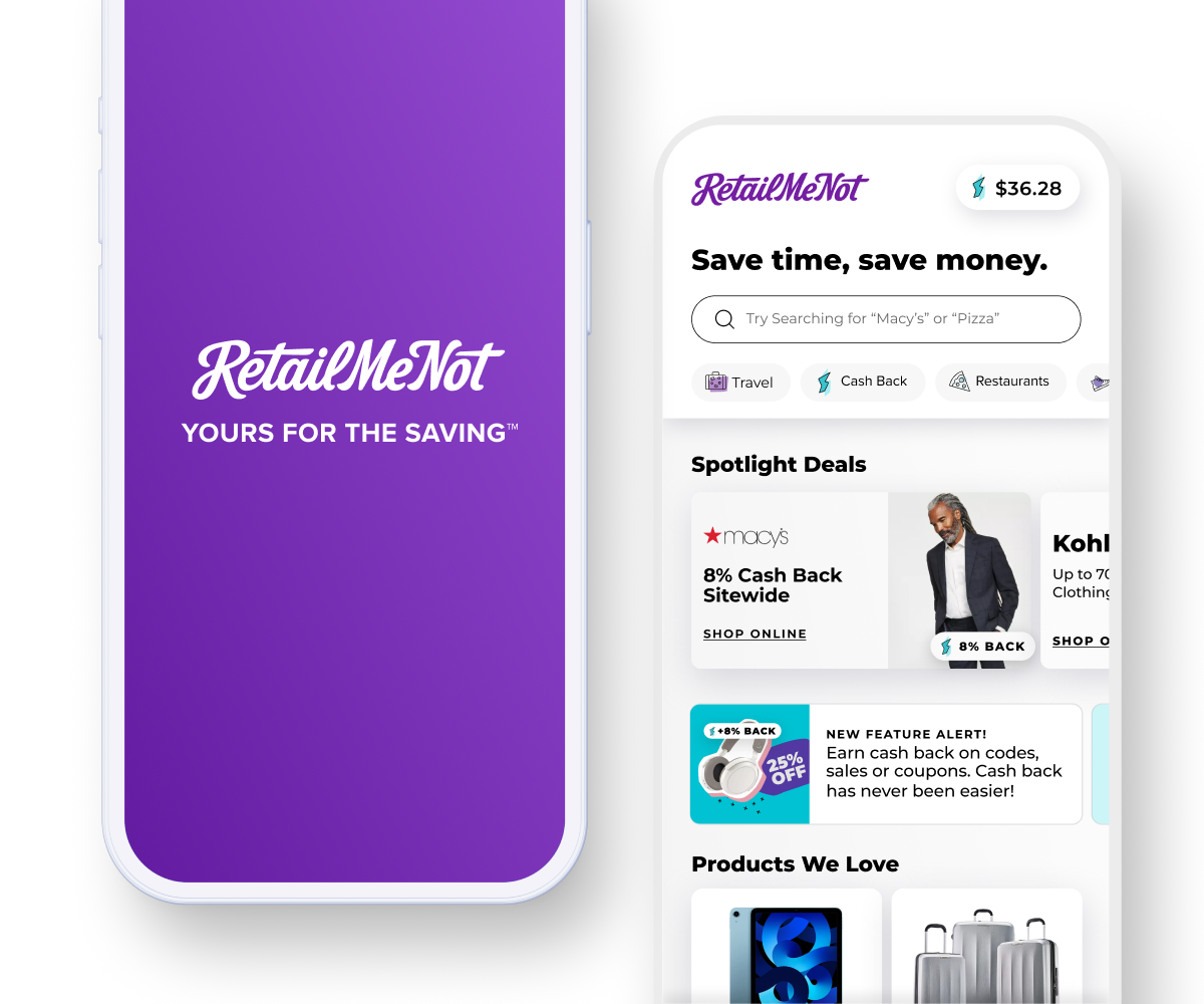
RetailMeNot App
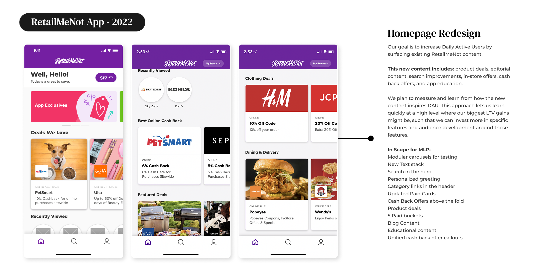
Homepage Redesign
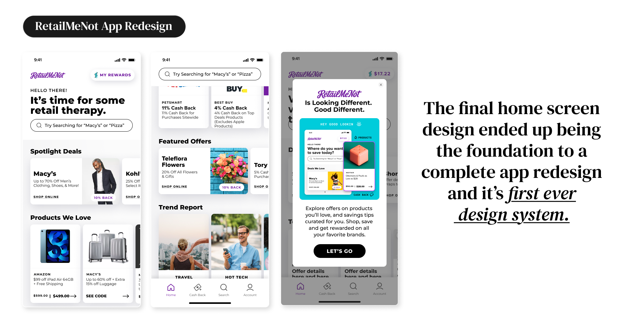
Led the redesign of the RetailMeNot app that minimized drop-off and increased retention.
PROBLEM
How can we better engage our loyal and repeat users to keep them coming back and minimize drop-off?
MY ROLE // Lead Product Designer iOS and Android
Product design, user research, product strategy, stakeholder alignment, information architecture, user flows, visual design, interaction design, copywriting, quality assurance, design guidelines.
KICKOFF + DISCOVERY
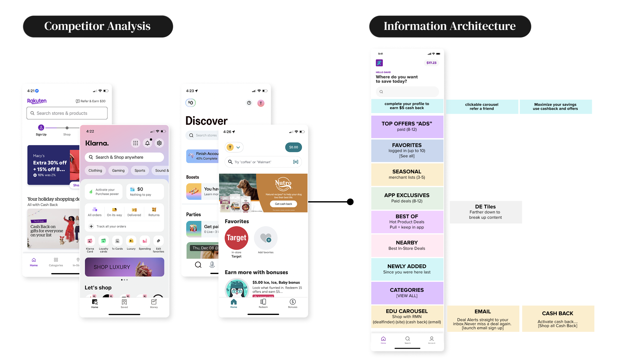
To ground our redesign in data and context, I first audited the current home screen to uncover friction and drop-off points from engagement metrics. From there, I conducted a competitive analysis of key players in the deal and fintech space to identify patterns, gaps, and opportunities for differentiation.
INSIGHTS
Through my competitive analysis, I found that brands like Rakuten, Karma, Klarna, and Honey made their home screens more engaging by diversifying content sections, introducing personalized recommendations, and highlighting top deals. Using these insights, we revisited our own engagement metrics to understand which content buckets and carousels resonated most with users. This gave us a strong foundation to build on—clarifying what to keep, what to refine, and how to elevate the overall user experience and design.
DEFINE + DISCOVERY
User feedback revealed that the app’s current design made discovering top deals challenging, and after three years without a visual update, it was time to modernize the experience both functionally and visually..
DESIGN + DEVELOPMENT
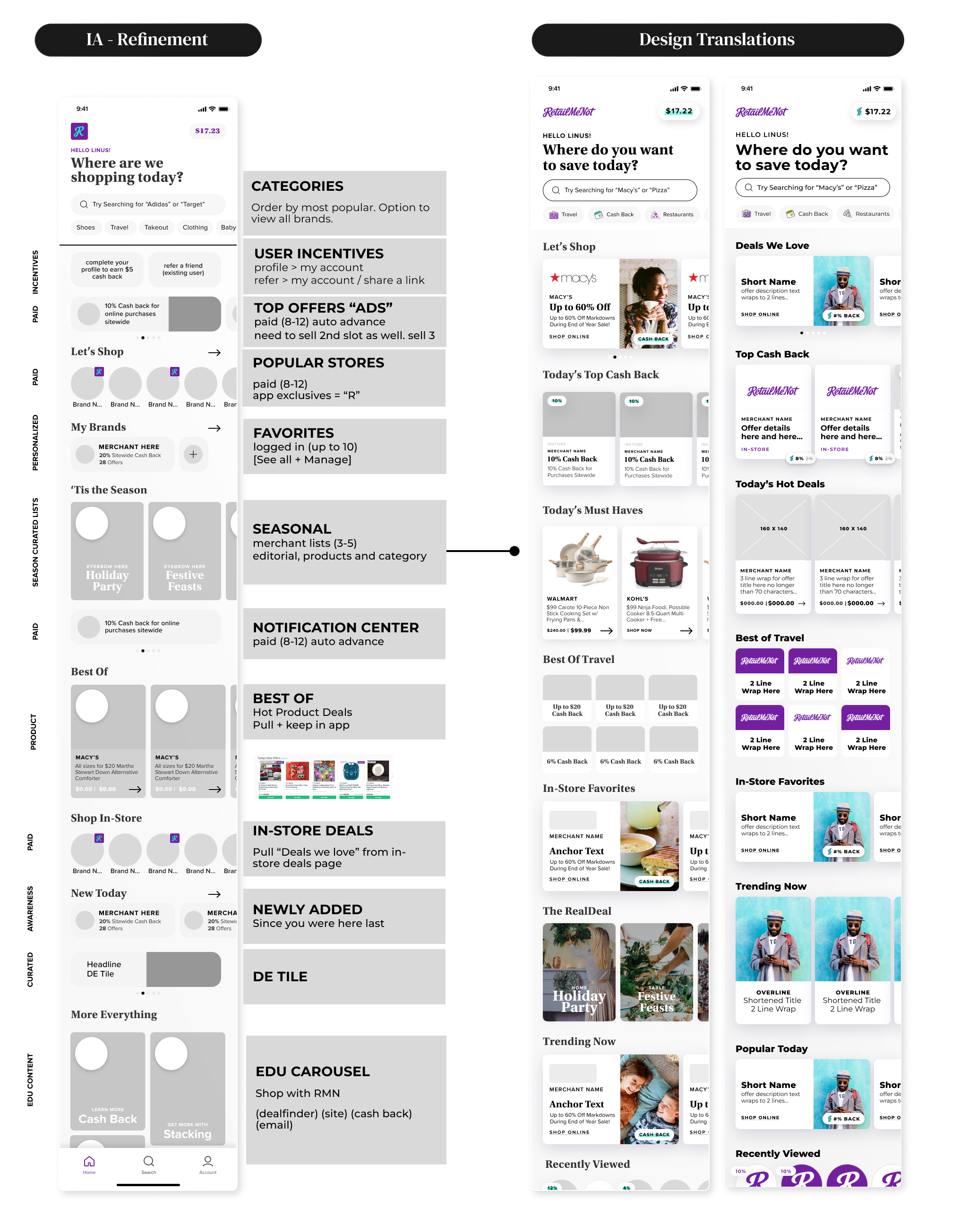
I started by mapping out several information architecture options to help the team align on the best blueprint for achieving our project goals. Once we reached consensus, I moved into designing a range of home screen variations, from low-effort concepts to more complex explorations. After aligning on a direction that balanced ambition with team bandwidth and project scope, we moved forward into user testing.
USER TESTING
To validate our design decisions, I ran unmoderated prototype tests comparing the existing home screen with the new designs. We focused on measuring user experience, engagement, and click-through rates to see if the redesign truly met our goals. The tests revealed clear improvements: users engaged more deeply with content, clicked through more frequently, and better understood the app’s features and programs. These insights confirmed that our redesign was moving the experience in the right direction and provided confidence to move forward with full implementation.
THE LAUNCH
The redesigned home screen was initially launched to 20% of our total user base—both new and existing users—to test adoption and viability. Performance metrics were positive across the board, enabling us to confidently proceed with a phased rollout to 100% of users in the following weeks.
OUTCOMES
Increased engagement
Increased conversion
Increased retention
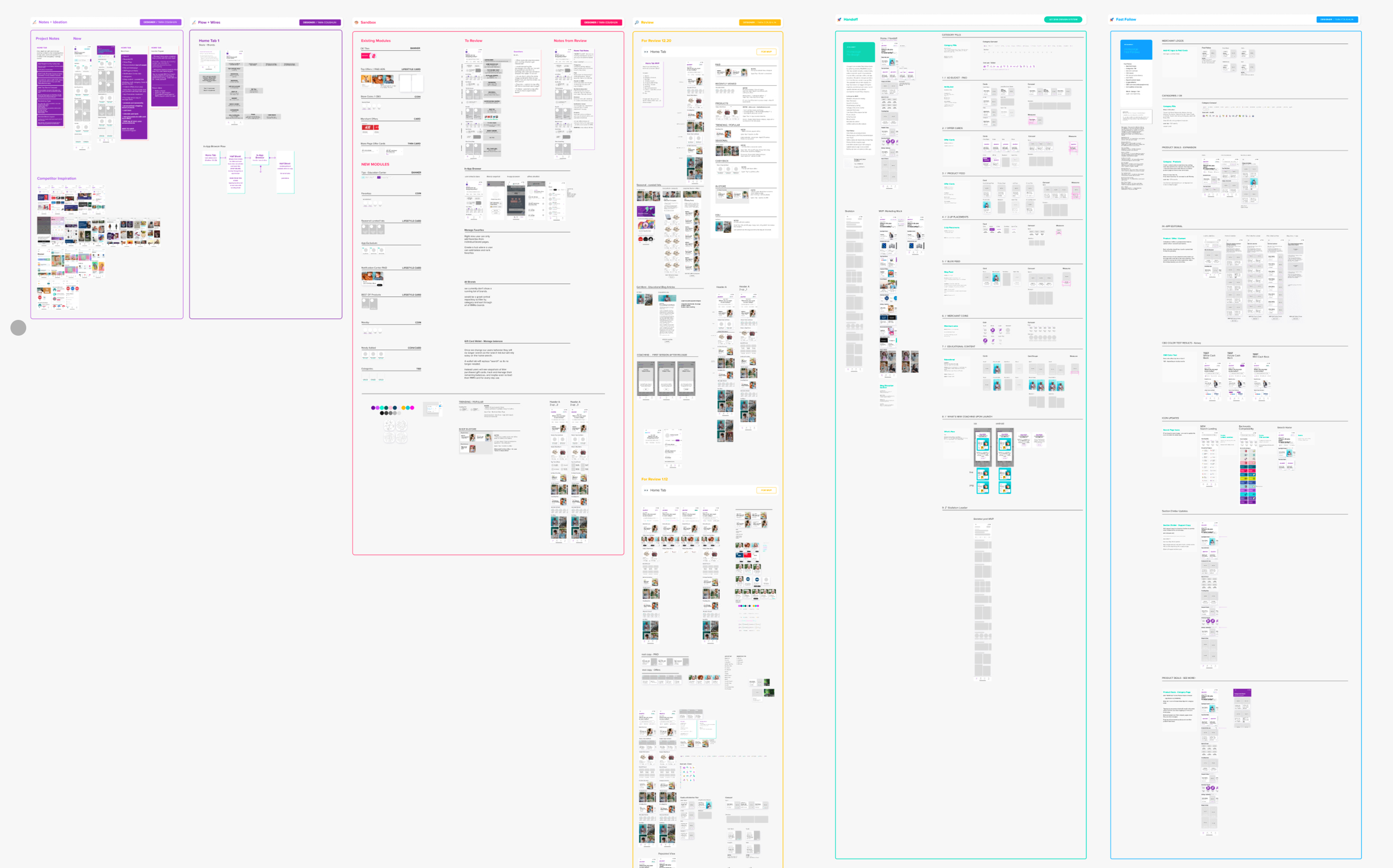
Full project file “Birds Eye view”